Author Archives: alphabetaworks

Parnassus Core Equity Fund (PRILX) – Returns-Based Analysis

Returns-Based Analysis and Fund Beta

In an earlier article, we discussed the failures of returns-based style analysis – a common method of estimating fund risk:

  • Returns-based analysis is usually flawed when portfolio risk varies over time.
  • Returns-based analysis may not even accurately estimate average or representative risk of the portfolio.
  • Flaws are most pronounced for the most active funds – precisely the ones most in need of accurate analysis.

These flaws can be addressed by analyzing historical portfolio holdings, estimating their factor exposures, and aggregating these estimates. This approach requires a robust risk model and is favored by AlphaBetaWorks.

Parnassus Core Equity Fund (PRILX) Returns-Based Beta

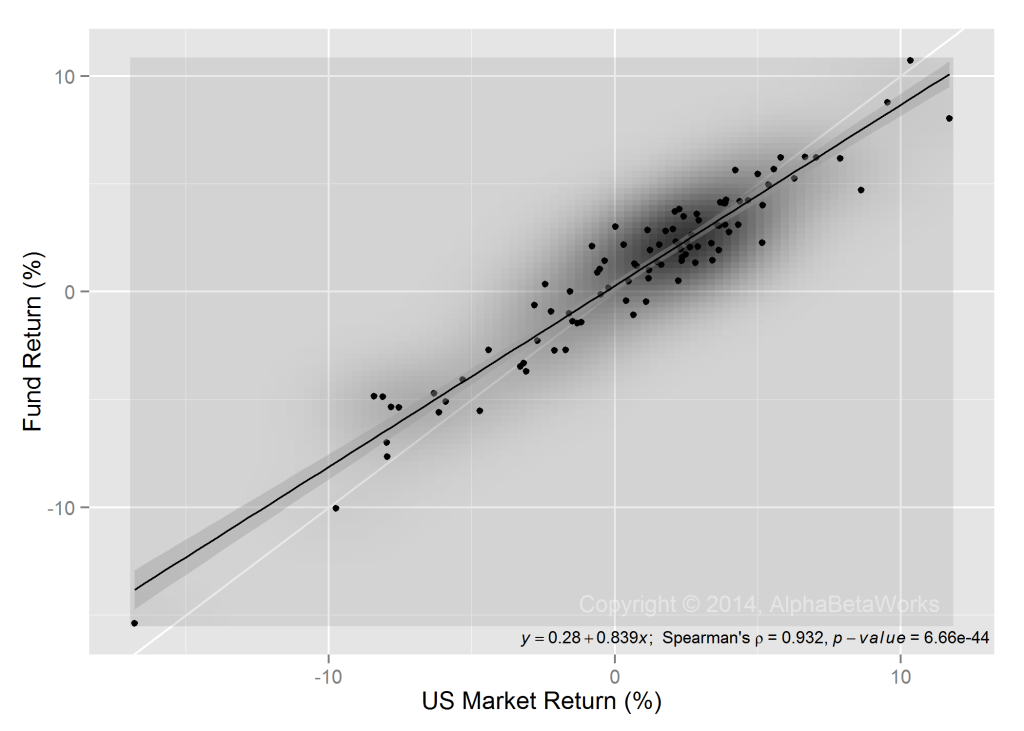
Returns-based analysis estimates market exposure (beta) using one or more linear regressions, possibly with several independent variables. We use one fund, the Parnassus Core Equity Fund (PRILX) as an example. For PRILX, a simple single-factor linear regression estimates beta near 0.84:

Chart of the relationship of the returns of U.S. Market and Parnassus Core Equity Fund (PRILX)

U.S. Market and Parnassus Core Equity Fund (PRILX) Returns

This type of regression is the foundation of returns-based style analysis.

Parnassus Core Equity Fund (PRILX) Beta History

A key assumption of returns-based analysis is that beta does not vary over the regression period.

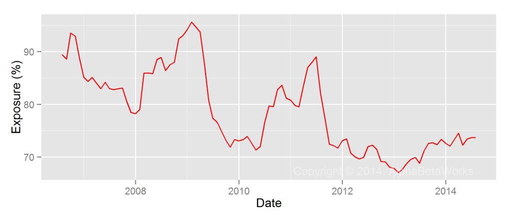
To test this U.S. Market beta estimate, we used the AlphaBetaWorks Statistical Equity Risk Model to estimate monthly U.S. Market exposures of PRILX. The model estimated the exposures of individual holdings. It then combined these into aggregate portfolio beta. Over the past 10 years, the fund has varied U.S. Market exposure between 68% and 95% (0.68 to 0.95 beta):

Chart of the historical U.S. Market Exposure (Beta) of Parnassus Core Equity Fund (PRILX)

Parnassus Core Equity Fund (PRILX) – Historical U.S. Market Exposure (Beta)

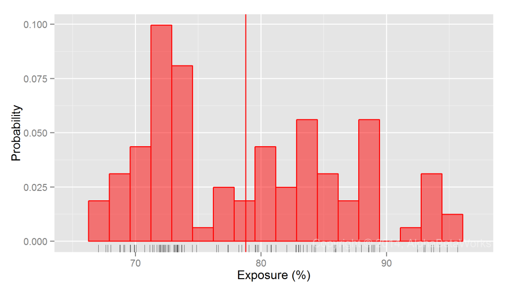
PRILX’s average U.S. Market exposure was approximately 79% (0.79 beta) during the period. However, actual beta was rarely near the average:

Chart of the distribution of U.S. Market Exposure (Beta) of Parnassus Core Equity Fund (PRILX)

Parnassus Core Equity Fund (PRILX) – U.S. Market Exposure (Beta) Distribution

Implications of Beta Estimation Errors

For low-volatility funds whose risk profiles vary little over time, the shortcomings of returns-based attribution are relatively minor. For higher volatility strategies, they are severe.

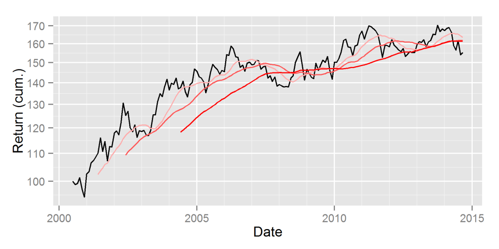
The 5% difference in estimate exposure (0.05 difference in estimated beta) above is not trivial: U.S. Market is up approximately 140% over the past 10 years. A 0.05 difference in estimated average beta translates into a 7% difference in returns attributable to beta over this period.

In addition, returns-based analysis obscured the variation in beta over history: Since 2012 beta has been below 0.75. Consequently, returns-bases analysis’ attribution of performance to market and non-market sources is further off the mark.

Berkshire’s Long Equity Position Sizing

Generally, Berkshire Hathaway’s largest positions are not its best ones. If Berkshire sized all positions equally for the past 12 years, the risk adjusted return of long equity portfolio would have been approximately 5% higher:

Chart of the long equity position sizing return of Berkshire Hathaway Inc.

Berkshire Hathaway Position Sizing Return – Long Equity Positions

Position sizing cost portfolio approximately 10% over the past three years.

Berkshire’s managers appear to have made some of their largest positions things they can scale, rather than things they want to scale. Given the size of Berkshire’s portfolio, it is remarkable the sizing return is not worse.

Investors who follow skilled managers tend to assume their top positions are their best ideas. This is often wrong.


Greenlight Capital’s Energy Equity Security Selection

As we discussed in an earlier article, excellent investors are not equally proficient in all areas.  While Greenlight’s overall stock picking performance is stellar, it does not extend to all sectors. Its picks are excellent in technology and subpar in healthcare, for instance.  Results are mixed in energy.

The following is a chart of the estimated security selection (stock picking) return due to the energy positions of Greenlight Capital. This is Greenlight’s αReturn – the estimated annual percentage return a fund would have generated in a flat market. The chart covers long equity (13F) portfolio:

Chart of the contribution of long  energy equity positions to the long equity security selection (stock picking) return of Greenlight Capital

Greenlight Capital Long Equity Security Selection Return – Energy Contribution

Over the period, Greenlight’s energy positions underperformed a passive portfolio with similar systematic risk by approximately 1%.

Talented investors’ skills are specific. Greenlight’s followers should be careful before investing in an energy stock based solely on Greenlight’s involvement.

Pure Small Cap Performance

In recent months, the poor performance of small companies has led to a flurry of analysis. Unfortunately, most analysis overlooks small caps’ broad market risk, or beta, and fails to identify pure small cap performance. Consequently, this analysis is imprecise and its conclusions are inaccurate. Much more telling is Size Risk Factor – a pure small cap performance indicator. It reveals that small cap performance has been poor for some time.

Small Cap and Large Cap Index Returns

A common approach to analyzing the relative performance of small caps is comparing a small cap index or ETF to a large cap index or ETF. Performance is compared by plotting price ratios, or relative returns. For instance, the chart below is a comparison of the iShares Russell 2000 ETF (IWM) relative to the SPDR S&P 500 ETF Trust (SPY):

Chart of the cumulative relative return of iShares Russell 2000 ETF (IWM) relative to SPDR S&P 500 ETF Trust (SPY)

iShares Russell 2000 ETF (IWM) Cumulative Relative Return vs. SPDR S&P 500 ETF Trust (SPY)

While this is an accurate portrayal of the relative performance of the two ETFs, it does not capture the pure effect of constituents’ sizes. There are a number of differences between the two funds. Size is one of the most significant. The other is market exposure, or market beta.

Small caps tend to have higher beta than large caps: Recent U.S. Market exposure (beta) of IWM is approximately 1.23. It is approximately 0.95 for SPY. Because of this difference in beta, market is often the dominant factor of relative performance. Hence, analyzing trends in small caps requires more than simply looking at a particular index.

The Size Factor – Pure Small Cap Performance

To isolate the pure small cap performance, we must remove the effect of market and sector risks. AlphaBetaWorks’ Size Factor (ABW Size Factor) strips market and sector effects from security returns, revealing performance purely due to size. The ABW Size Factor is the difference in returns, net of market and sector effects, between the largest and the smallest stocks. The opposite of the ABW Size Factor is the ABW Small-Cap Factor.

ABW Size Factor is closely related to the Fama–French SMB Factor, but with enhancements: SMB Factor captures size risk, but it also picks up market and sector returns. ABW Size Factor strips out market and sector effects for a pure size measurement.

With market effect filtered out, the picture looks different. U.S. small caps have been under-performing since 2010. 2014 has been an especially bad year:

Chart of the cumulative return of U.S. small cap (negative of the Size factor)

U.S. -Size (Small Cap) Factor Cumulative Return History

On a market-risk-adjusted basis, IWM underperformed by approximately 12% over the 3 year period ending 12/31/2013, even before the steep losses of 2014. Investors aware of the pure small cap performance would not have been surprised by the 2014 returns of small caps.

Unlike the performance of small cap indices, buoyed by their high beta and the advancing market,  Size Factor has been flashing warning signs for small cap investors for a few years.

The information herein is not represented or warranted to be accurate, correct, complete or timely.
Past performance is no guarantee of future results.
Copyright © 2012-2014, AlphaBetaWorks, a division of Alpha Beta Analytics, LLC. All rights reserved.
Content may not be republished without express written consent.

iShares Core High Dividend ETF (HDV) Alpha and Beta

iShares Core High Dividend ETF (HDV) is a low-risk fund that has consistently delivered positive risk-adjusted return.

iShares Core High Dividend ETF (HDV) – Historical Beta

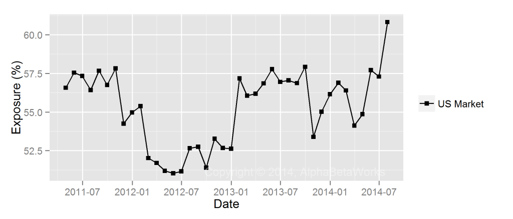
U.S. Market exposure (beta) of the fund has varied in the narrow window between 0.52 and 0.60:

Chart of the history of U.S. Market Beta for iShares Core High Dividend ETF (HDV)

iShares Core High Dividend ETF (HDV) U.S. Market Beta History

iShares Core High Dividend ETF (HDV) – Historical Alpha

The fund has consistently generated positive risk-adjusted return from security selection (αReturn):

Chart of the risk-adjusted returns from security selection of iShares Core High Dividend ETF (HDV)

iShares Core High Dividend ETF (HDV) Security Selection Return History

This αReturn exceeds the results of 95% of U.S. mutual funds with medium and lower portfolio turnover rates:

Chart of the security selection return of iShares Core High Dividend ETF (HDV) compared to the peer group of all U.S. mutual funds with medium turnover

iShares Core High Dividend ETF (HDV) Security Selection Return Vs Peers


Currency Risk and Local Currency Beta

Risk models and portfolio analysis tools often assume that all foreign securities have local currency exposure (beta) of one, under the convenient belief that reference currency performance due to local currency changes is simply local currency appreciation.

Reality is rarely this convenient. This standard approach misrepresents the true currency risk of most foreign investments. For example, an exporter’s margins will expand when its domestic currency depreciates; thus its local currency value will increase as the currency declines. Importers will act in the opposite fashion. Meanwhile, security valuations in emerging markets are vulnerable to external capital flows, amplifying currency risk.

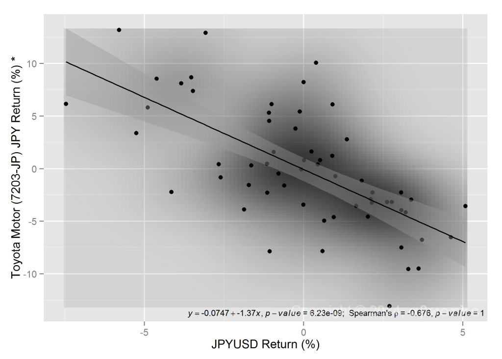
The following figure illustrates the relationship between the JPYUSD exchange rate and the local (JPY) share price for Toyota – an example representative of other Japanese exporters:

The Correlation Between Toyota's Residual Return, in Local Currency, and JPYUSD FX Rate

Toyota’s Local Currency Beta

When Toyota Motor Corporation sells cars outside of Japan, it receives dollars from U.S. sales, Euros for European sales, etc. Meanwhile, some of the costs of these sales are incurred in Japan. As JPY declines relative to USD or EUR, costs decline relative to sales and margins expand. As margins expand and profits increase, Toyota’s shares appreciate. The result is a negative relationship between Toyota’s share price and JPY.

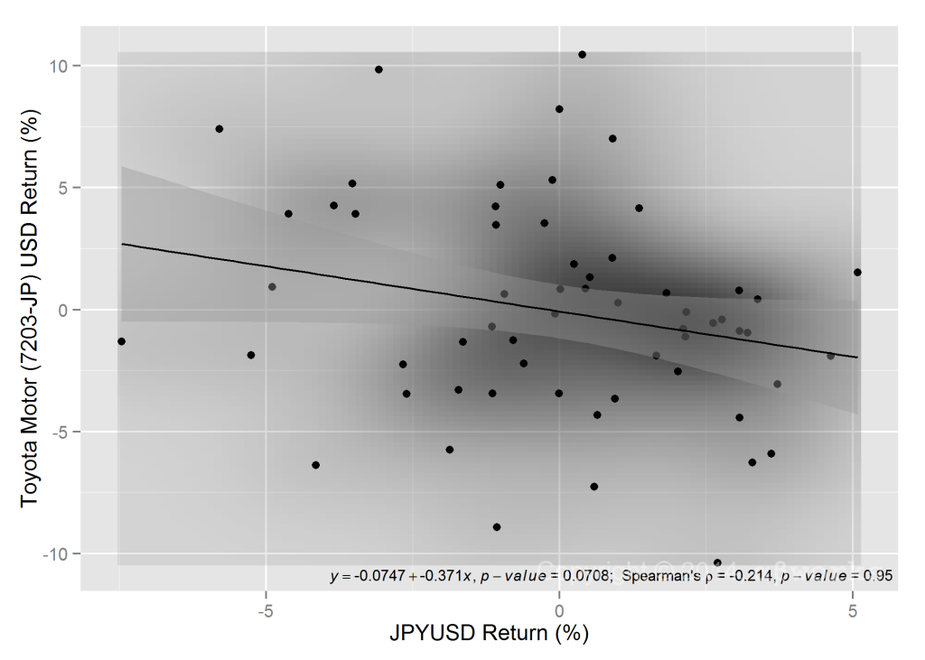
It is tempting to think that a U.S. investor who holds Toyota un-hedged has long JPY exposure. In reality, this investor is short JPY. The local currency beta of Toyota more than offsets the JPYUSD FX risk. $1 Invested in Toyota, un-hedged, creates approximately $0.37 short JPY exposure:

Chart of the Correlation Between Toyota Price, in USD, and JPYUSD FX Rate

Toyota’s USD Price Local Currency Beta

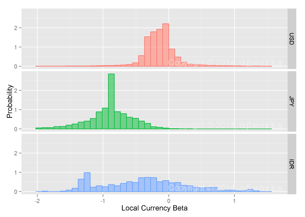
In general, local currency betas vary among and within markets. Simple (and widely used) estimates of currency risk can thus be misleading:

Charts of the Distribution of Local Currency Betas Across Various Markets

Local Currency Beta Distribution Across Markets

Currency risk can be especially complex in emerging markets that are broadly dependent on external capital flows, yet have a number of exporters that benefit from currency declines.

The AlphaBetaWorks World Equity Risk Model encompasses local currency beta and the translation from local to reference currency. This compound process provides an edge to most international investors and was valuable, for example, to U.S. investors looking to be long Japanese equities in 2012 and 2013.

The information herein is not represented or warranted to be accurate, correct, complete or timely.
Past performance is no guarantee of future results.
Copyright © 2012-2014, 
AlphaBetaWorks, a division of Alpha Beta Analytics, LLC. All rights reserved.
Content may not be republished without express written consent.

Pershing Square’s Finance Sector Security Selection Performance

Pershing square has a phenomenal track record of stock picking. Over the past 10 years, it has generated approximately 200% risk-adjusted return from security selection in its long (13F) portfolio. If market were flat for the past 10 years, the portfolio would have gained approximately 200%. We call this risk-adjusted return αReturn:

Chart of the Security Selection Return of Pershing Square's Long Portfolio

Pershing Square Security Selection Return – Long Positions

The performance of the firm’s finance sector stock picks is almost as impressive, just slightly less strong than the overall portfolio and less consistent. Over the past 10 years Pershing Square’s long finance sector portfolio generated approximately 150% risk-adjusted return from stock picking (αReturn):

Chart of the Security Selection Return of  Pershing Square's Long Finance Sector Portfolio

Pershing Square Finance Sector Portfolio Security Selection Return – Long Positions

This is encouraging for the investors in Fannie Mae (FNMA) and Freddie Mac (FMCC). Bill Ackman has invested in the companies and sees them as the most interesting opportunity since General Growth Properties (GGP) in 2008.

Greenlight’s Long Equity Position Sizing

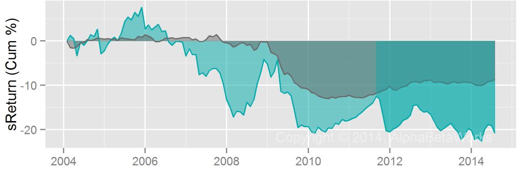
Greenlight’s top positions generally aren’t its best ones. It is common to assume that the top positions of skilled investors are their best ideas, but this is not always the case. If Greenlight sized all positions equally for the past 10 years, the risk adjusted return of long portfolio would have been approximately 20% higher.

We can’t know for sure whether Greenlight Capital can’t identify their best stock picks, or can’t scale them. What we do know is that the risk-adjusted return of their average position is higher than the risk-adjusted return of their top position. AlphaBetaWorks defines this return – the difference in stock picking (αReturn) between the actual portfolio and equal-size portfolio – as sReturn. For Greenlight, it is negative:

The Chart of Position Sizing Return for Long Positions of Greenlight Capital (13F Filings)

Greenlight Capital Position Sizing Return – Long Positions

When a successful manager’s fund grows, they may have trouble scaling their best picks. Their largest positions become the names they can, rather than prefer to, buy the most of.

Artisan International Fund (ARTIX) and Artisan International Value Fund (ARTKX) – Security Selection

Both Artisan International Fund (ARTIX) and Artisan International Value Fund (ARTKX) show excellent security selection (stock picking) performance over the past 10 years.

If all markets were flat for the past 10 years, ARTIX would have generated approximately 0% cumulative return from stock picking. This is not bad: The average fund would have lost money, even with the massive survivor bias of the peer group (funds that have been around for 10 years):

Chart of the Security Selection Return of Artisan International Fund (ARTIX)

Artisan International Fund (ARTIX) Security Selection Return

The results of ARTKX are spectacular. It would have made over 35% if markets were flat – one of the best track records among domestic and international funds:

Chart of the Security Selection Return of Artisan International Value Fund (ARTKX)

Artisan International Value Fund (ARTKX) Security Selection Return

A word of caution: ARTIX shows signs of over-capitalization and position scalability issues. It lost approximately 30% over the past 10 years due to position sizing. Its largest positions were (consistently) its worst stock picks:

The Position Sizing Return of Artisan International Fund (ARTIX)

Artisan International Fund (ARTIX) Position Sizing Return

In summary: Stock picking skills of the flagship international funds appear strong, but their scalability is a concern.

Paulson & Co Energy Sector Security Selection Skill

One should be careful when handling Paulson’s energy picks.

A portfolio of Paulson’s long (13F) energy positions has lost ~50% on a risk-adjusted basis. ETFs with the same market and energy sector exposures as the energy portfolio have outperformed it. The historical security selection (stock picking) performance of Paulson’s 13F positions is the blue αReturn on the following chart:

Chart of the Security Selection (Stock Picking) Performance of the Energy Sector Portfolio of Paulson & Co, Obtained From 13F Filings

Paulson & Co Energy Sector Security Selection Return – 13F Positions

The energy sector stock picking has stabilized of late, but there is probably a stronger case for going short these positions, than long.